Five Peaks Chalet
The Project
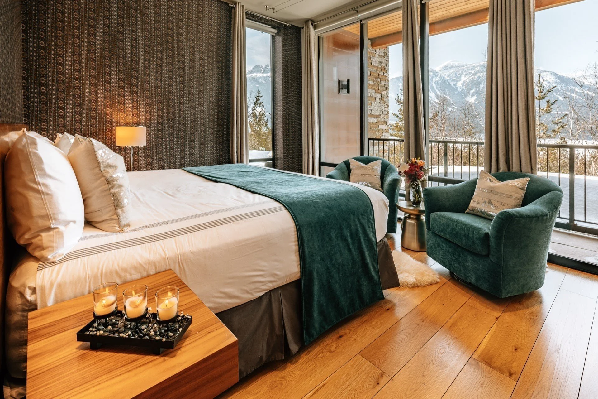
Five Peaks Chalet is a luxurious, all-inclusive ski chalet located at the base of the renowned Revelstoke Mountain Resort. The chalet offers exceptional hospitality experience paired with high- end customer services. Five Peaks Chalet was looking for a complete rebrand to modernize their image, appealing to both new and returning customers. This included developing a new brand name, color palette, typography, and overall brand aesthetic to better reflect their luxury offerings and breathtaking mountain location.
PROJECT TYPE
Brand Name Ideation + Visual Brand Identity + Logo Design
SERVICES
Brand Discovery & Strategy
Competitor & Industry Research
Creative Brainstorming & Generation
Logo Refresh
Brand Guidelines
The Challenge
The main challenge was that the existing branding for Five Peaks Chalet did not align with its evolving identity as a modern, luxury retreat surrounded by magnificent natural scenery. Formerly known as Whiteworth Chalet, the owner needed a new name and visual identity that communicated luxury, adventure, and rejuvenation, while keeping a connection to its original logo. The goal was to update and refresh the brand without losing the essence that made the chalet appealing to its loyal customer base.
The Goal
The goal of this rebranding project was to create a modern, clean, and approachable visual style that reflected the natural beauty of the surrounding mountains the chalet’s commitment to high-quality, exceptional service. The new brand aesthetic would help Five Peaks Chalet stand out from its competitors, appeal to its target audience, and seamlessly integrate with their website redesign.
Our Process
01 | DISCOVERY + RESEARCH
We began with in-depth research into the luxury hospitality and ski resort industries, analyzing competitors' branding and identifying key trends. This helped us understand the market landscape and the visual language used by other high-end chalets and resorts. During the brand discovery process, we explored Five Peaks Chalet’s mission, vision, values, and tone of voice, which informed the development of a brand strategy that resonated with their target audience.
02 | BRAND IDENTITY DEVELOPMENT
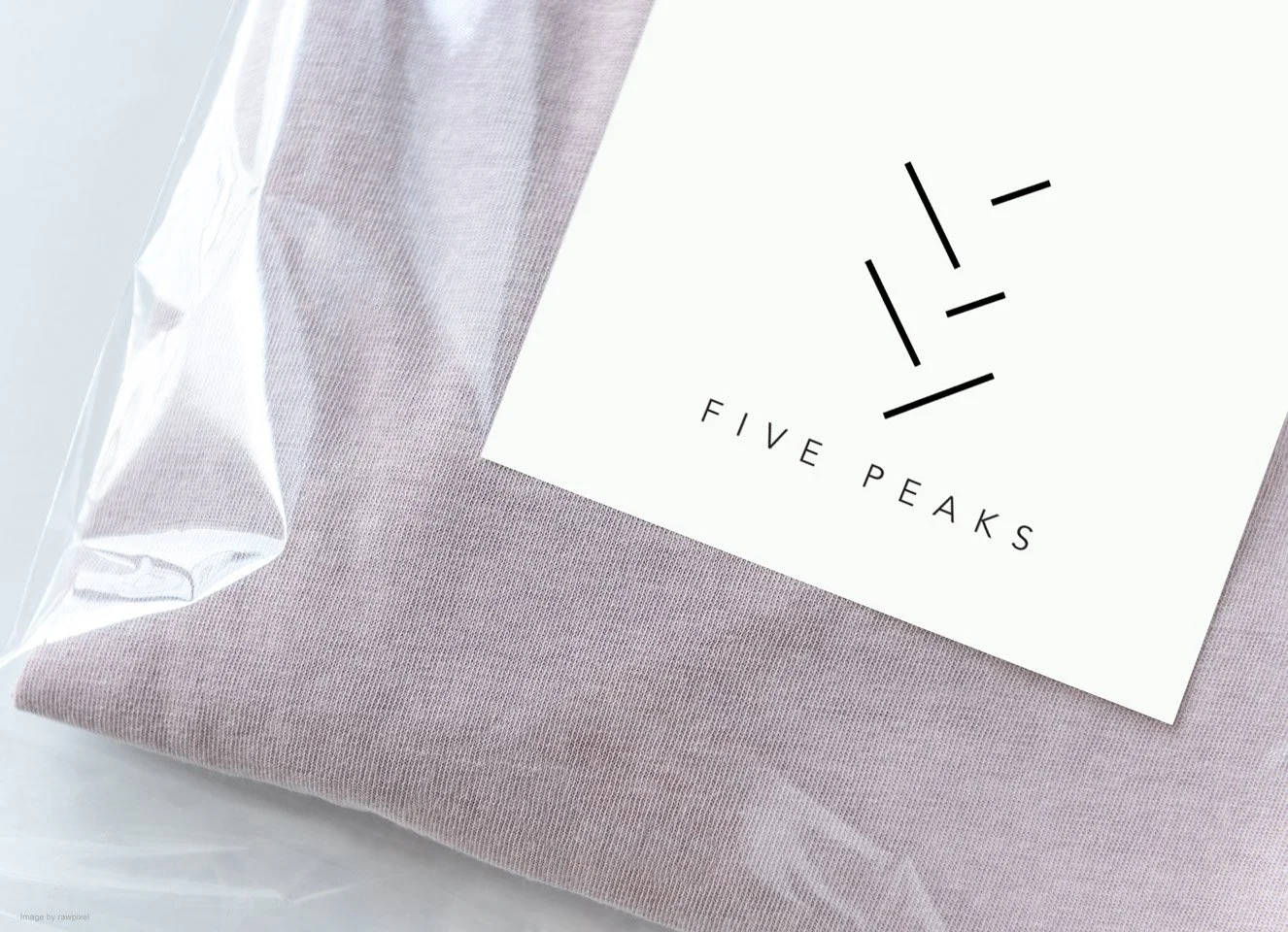
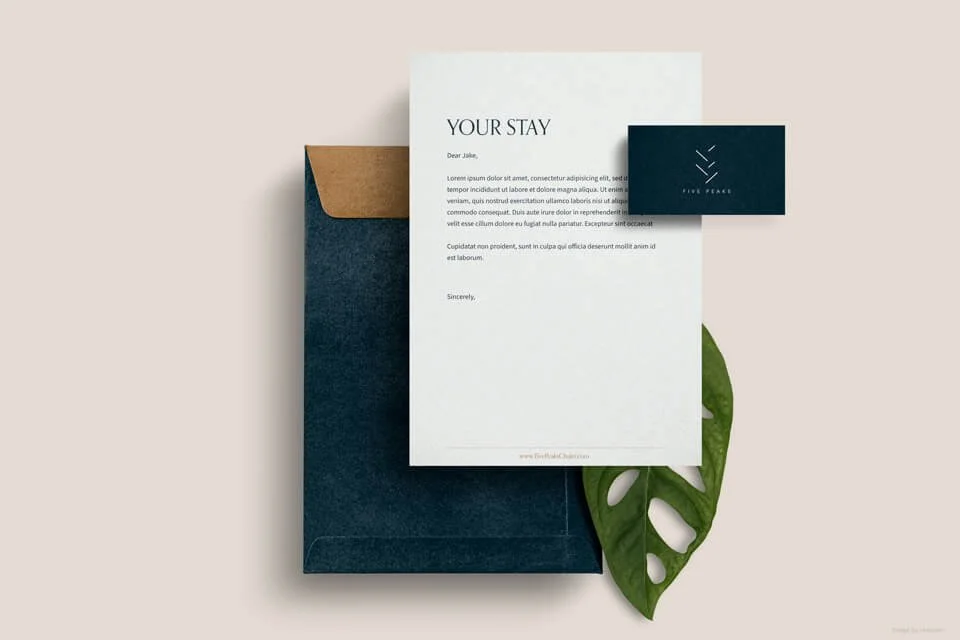
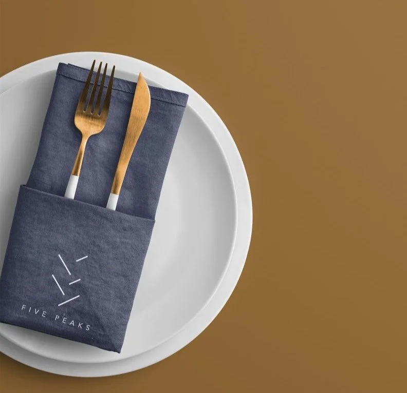
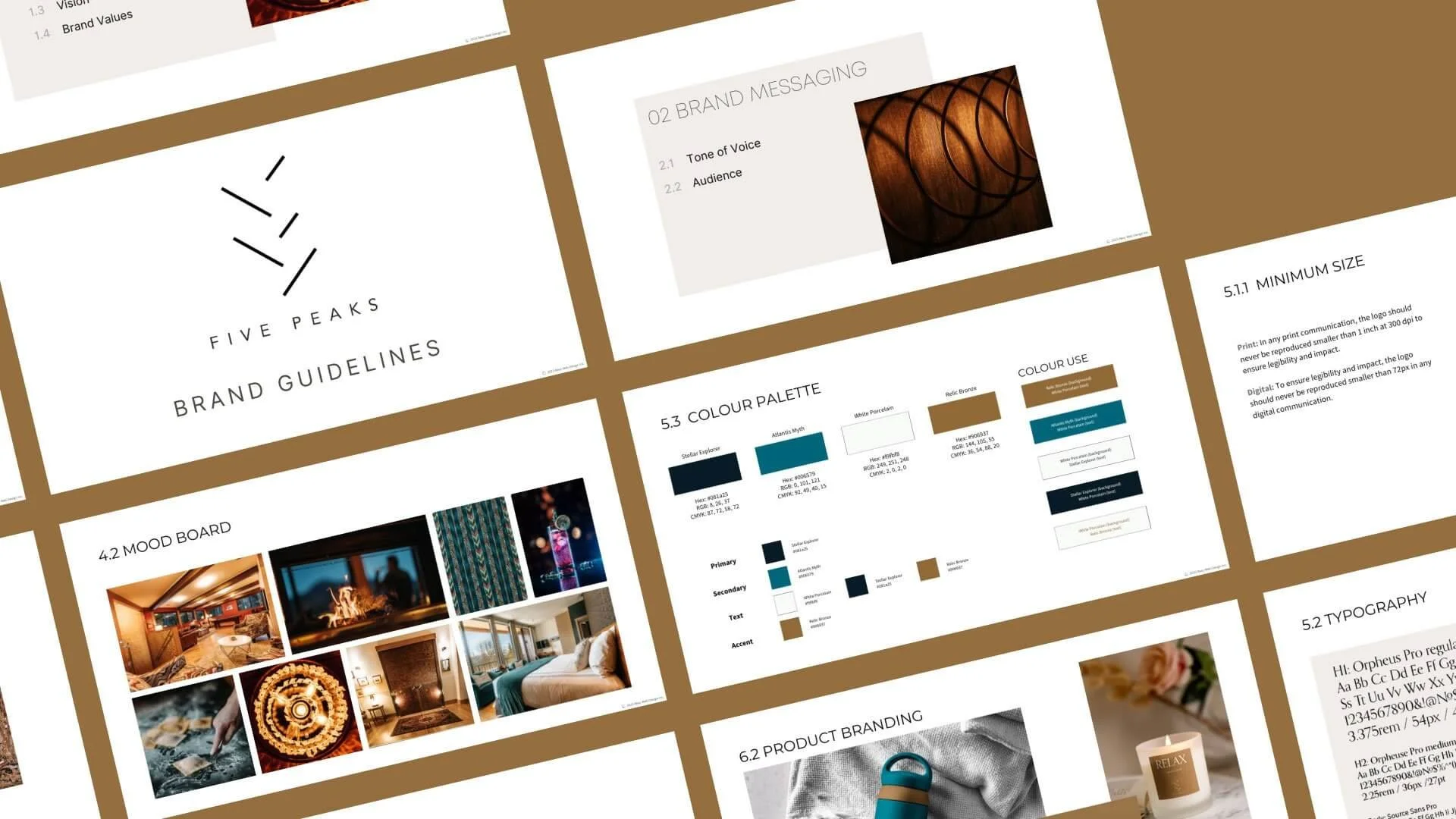
The visual identity drew inspiration from the luxury interiors of the chalet and the stunning outdoor elements of the surrounding mountain landscape. The color palette features copper gold and a cool-toned shade of mid cyan, chosen to evoke warmth, elegance, and tranquility, perfectly complementing the natural beauty of the chalet's environment. The typography was selected to be modern, legible, and timeless, ensuring a balance between luxury and approachability.
03 | NAME IDEATION
Through several brainstorming sessions and multiple rounds of evaluations, we arrived at the new name: FIVE PEAKS CHALET. This name effectively captures the natural beauty of the surroundings, referencing the “five mountain peaks”, while maintaining a connection to the original logo’s concept. The name evokes a sense of strength, elegance, and a connection to nature, while also suggesting a retreat-like atmosphere.
The Outcome
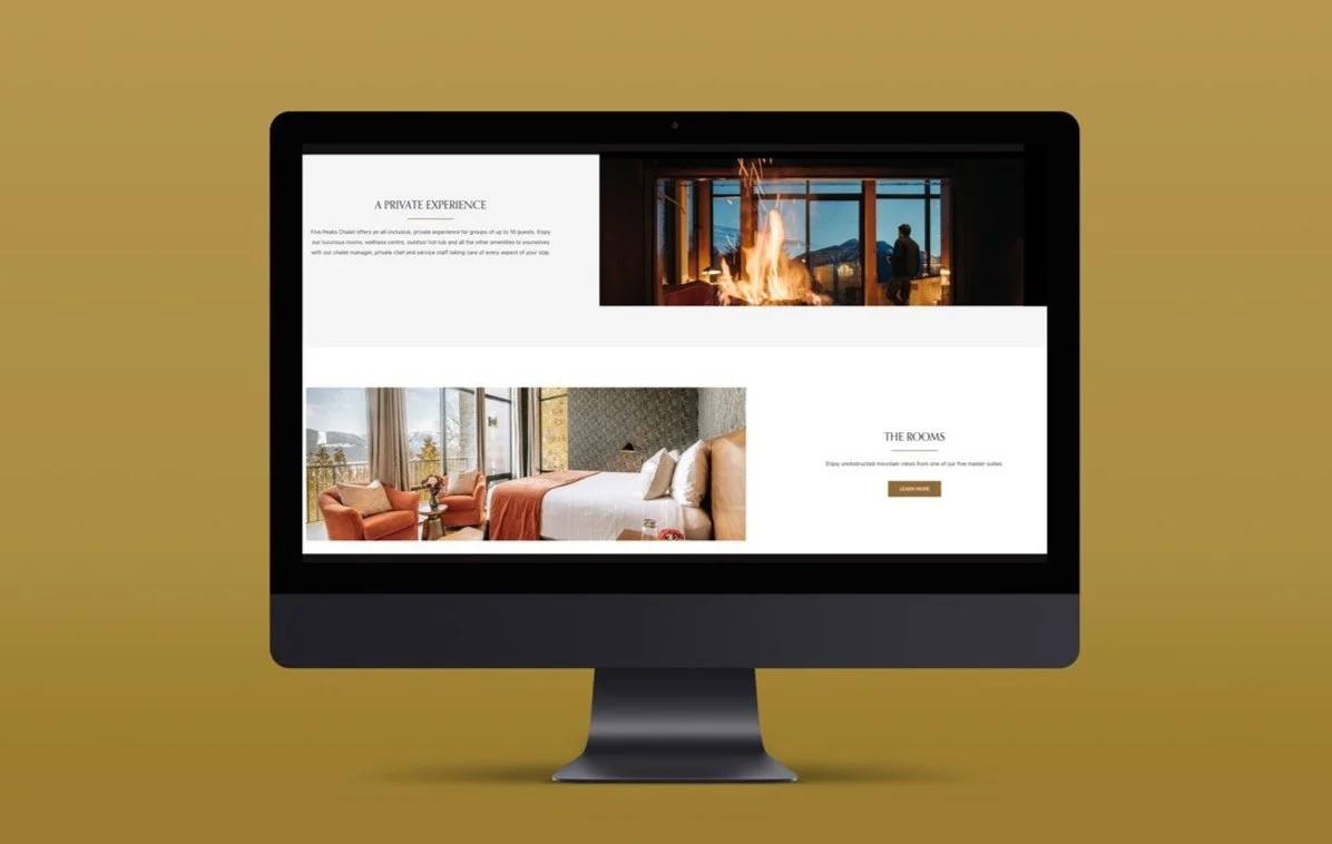
The updated visual brand identity has been successfully translated into the new website, where it communicates the chalet’s story more effectively and aligns with its luxurious offerings. The visual consistency across all digital and print materials enhances the brand’s presence and recognition.
To maintain a cohesive brand identity across various touchpoints, we created comprehensive brand guidelines that outline how to apply the logo, colors, typography, and other design elements consistently across all platforms and media channels.

Final Thoughts
The rebranding of Five Peaks Chalet was an exciting and rewarding challenge, particularly the name ideation process, which was critical in capturing the essence of the brand. I learned the importance of blending modern design with the legacy of the brand, ensuring that the new identity feels both fresh and aligned with the original values.
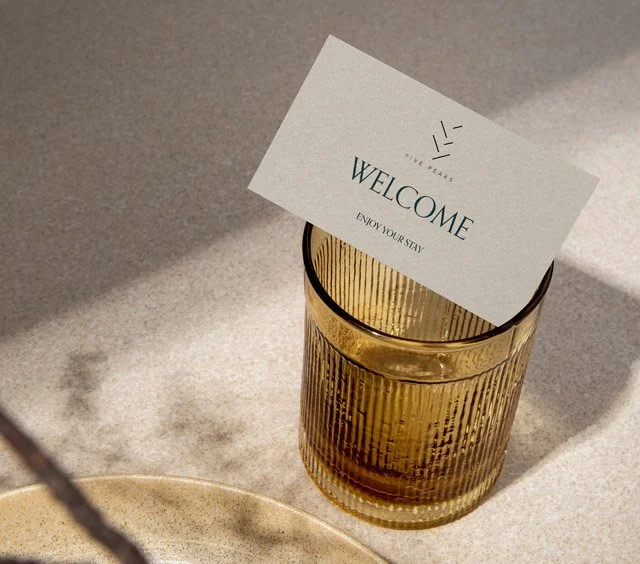
Brand in Use